Client: Danerolles Scope:
Packaging design, 3D visualisation, brand system
The email arrived out of nowhere.
Danerolles was launching something new. A chilled cookie dough range. Nothing like their croissants. Nothing like anything they had done before. The brief was short: fresh, alluring, colourful. Totally different than what Danerolles is traditionally known for. But still recognisably Danerolles.
That last part is where the work actually lives.
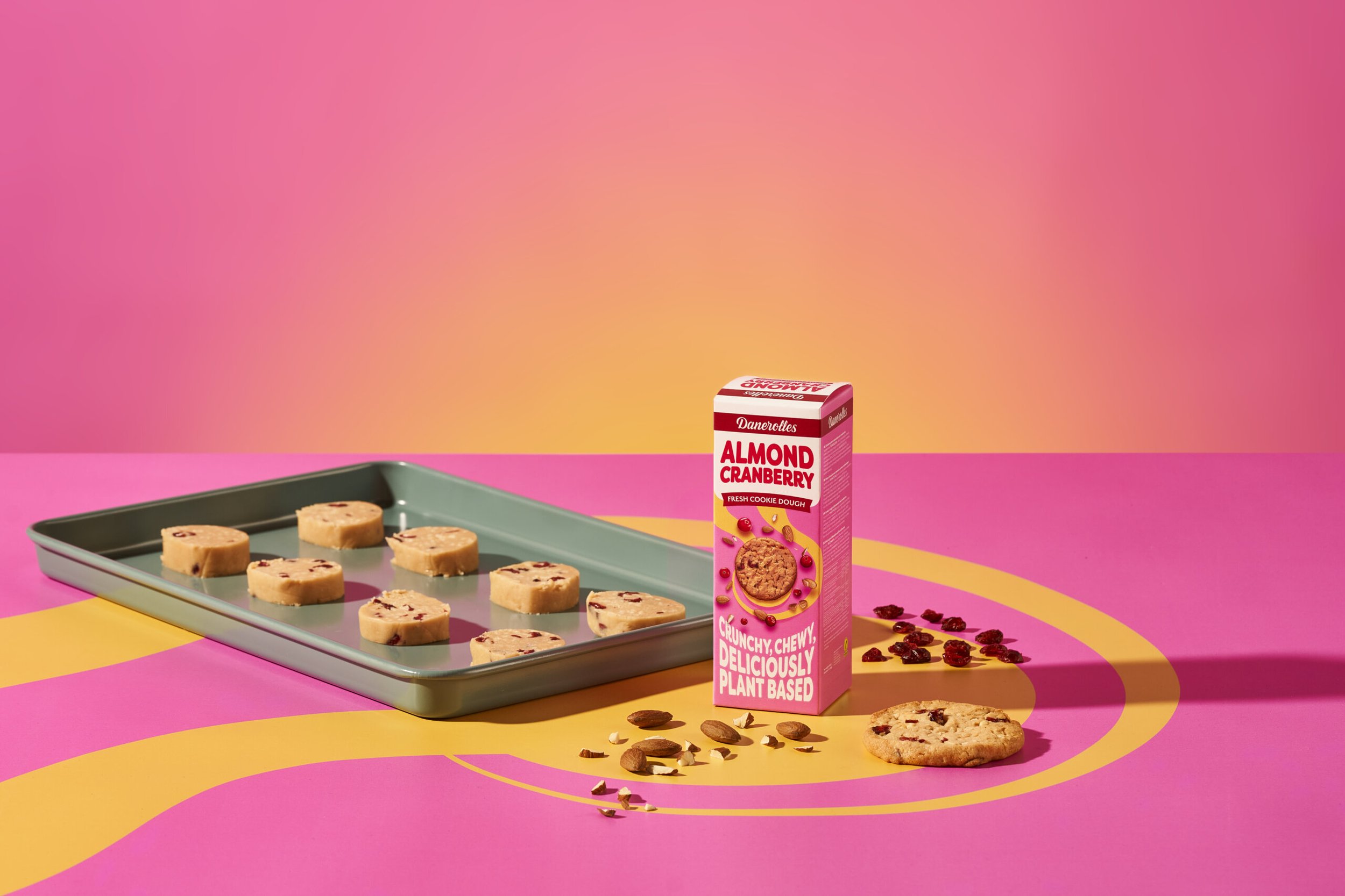
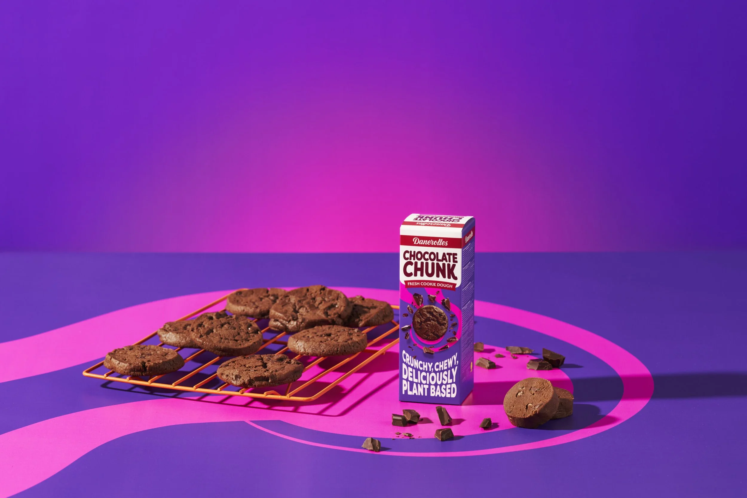
Cookie dough has a specific feeling. It is not a sophisticated product. It is the raw dough you sneaked from the bowl as a kid, the candy shop you walked past after school, the kind of thing that makes people smile before they have even tasted it. The packaging needed to carry that feeling while sitting next to croissants on a supermarket shelf and not looking like it came from a different brand entirely.
We leaned into contrast. Bold colours, playful shapes, something that felt like a treat before you even opened it. The vacuum-sealed sausage format ‘slice exactly what you need, bake the rest’ gave us an unusual canvas to work with. We built it out in 3D first, testing how the design held up in real retail environments before anything went to production.
The first version launched well. Fresh, people said. Playful. But we noticed it had drifted slightly too far from Danerolles' visual lineage. So we brought it back. Closer to the core. Same personality, better grounded.
That rebalancing is the part of packaging work most people never see. The version that ships is rarely the first good idea. It is the idea that survived contact with the brand it belongs to.