Client: Bol
Year: 2025–ongoing
Scope: Category visual language, seasonal campaigns, AI-driven image system
Most brands have more visual content to produce than they have time or budget to produce it properly. The bigger the platform, the worse that problem gets.
Bol asked us to solve it without sacrificing what the brand looks like.
Over nine months we have been producing visual content across the full range of what Bol sells and celebrates. Category pages. Seasonal campaigns. Individual product visuals. Valentine's Day. Summer. Budget lines. Refurbished electronics. The commercial calendar at a platform this size never stops.
We started by building a system rather than making individual assets. A set of visual rules specific enough to keep everything on brand and flexible enough to work across completely different product territories.
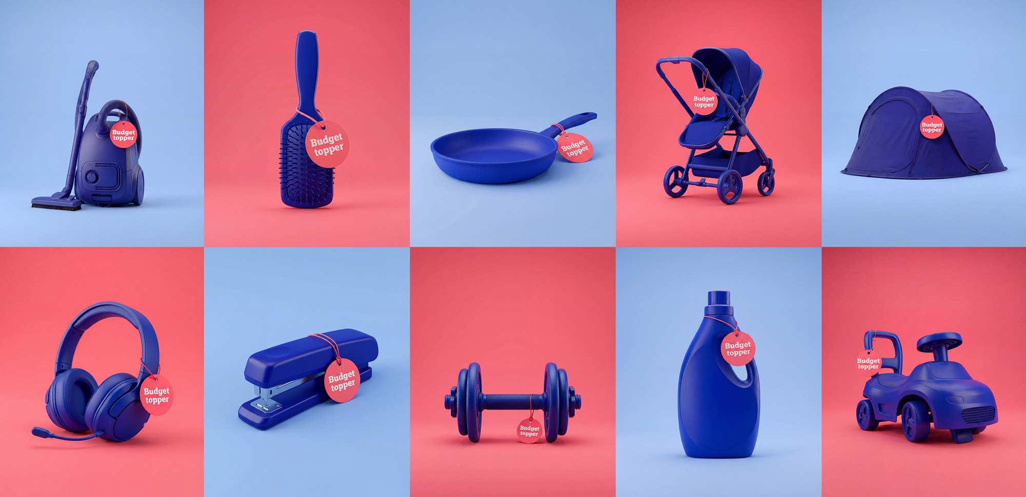
Budgettoppers and Refurbished show how far apart those territories can be.
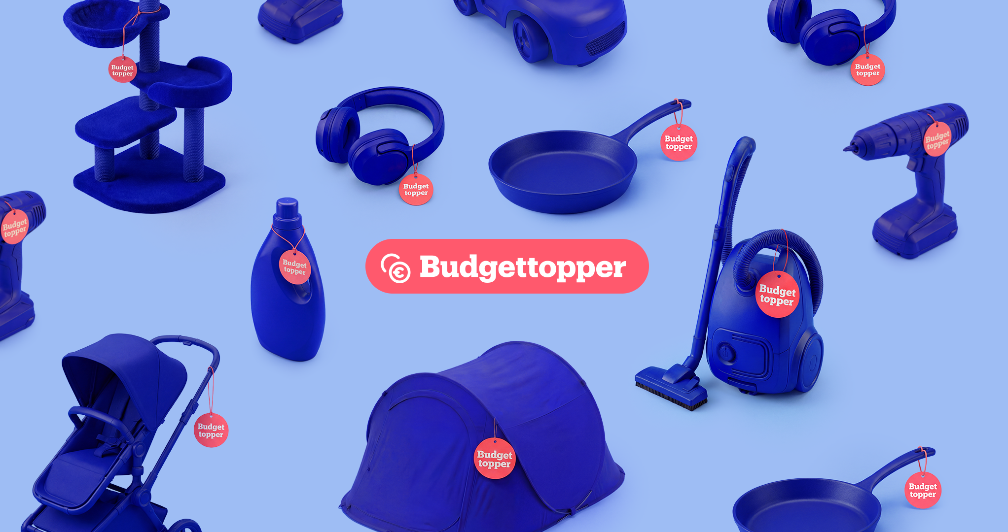
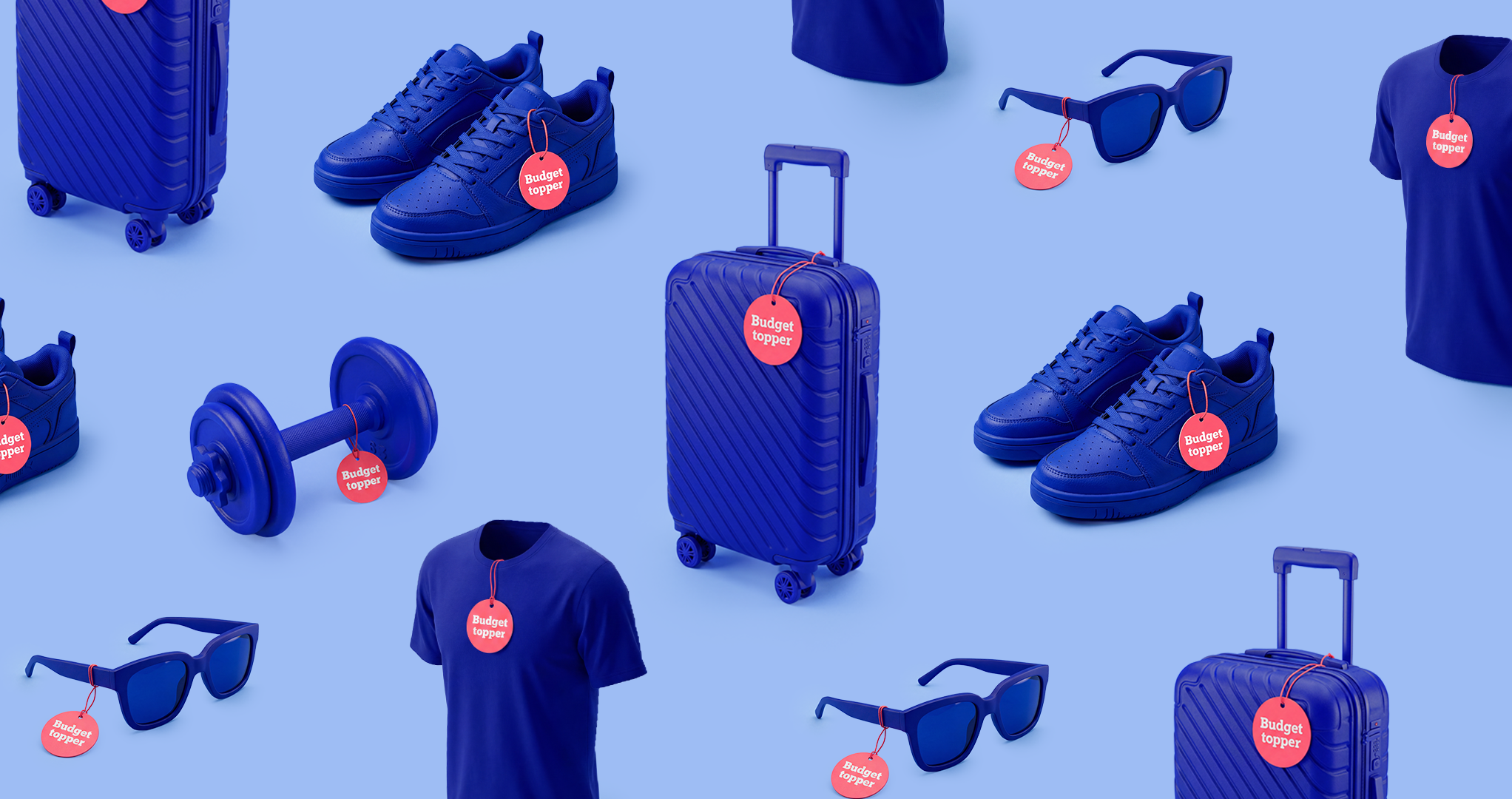
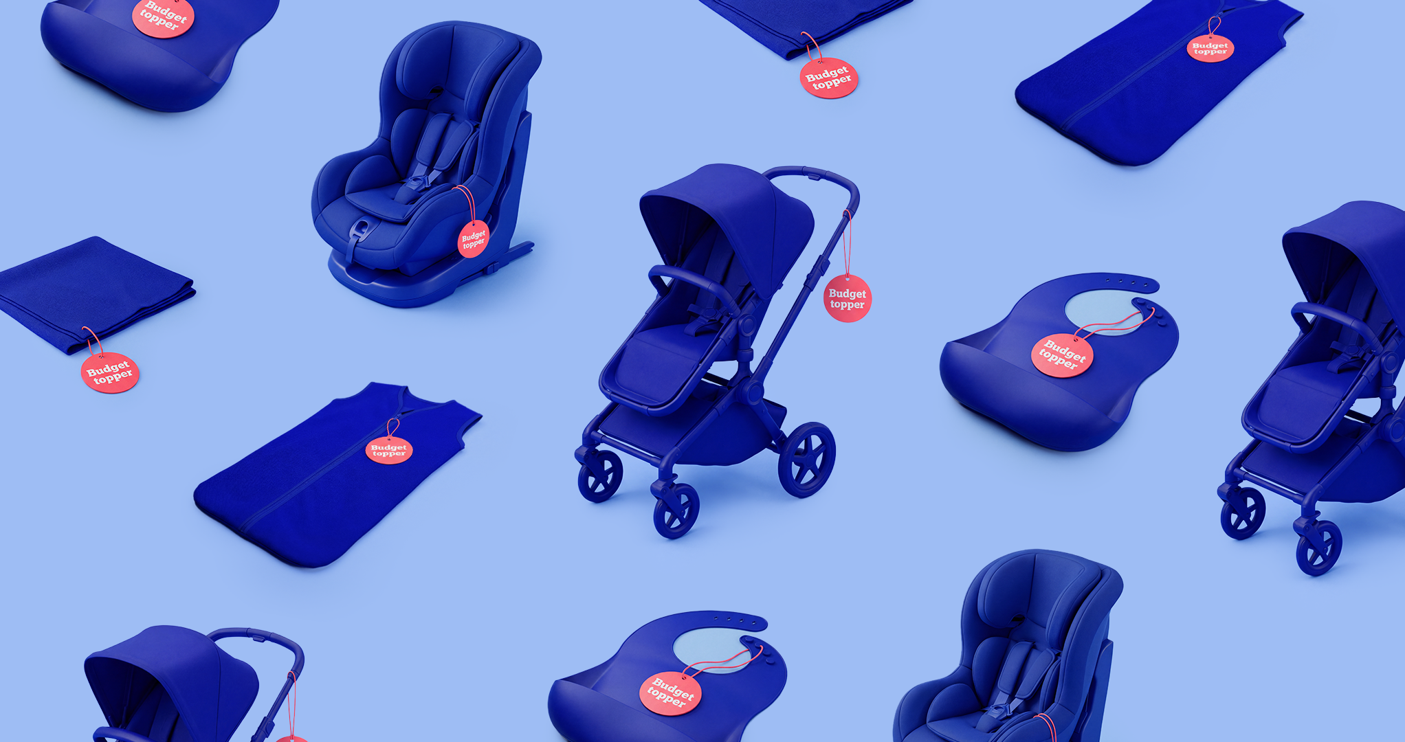
Budgettoppers needed to feel exciting. Value without embarrassment. Products in Bol's navy blue against warm pink. Bold, playful, worth wanting even when the price point is low.
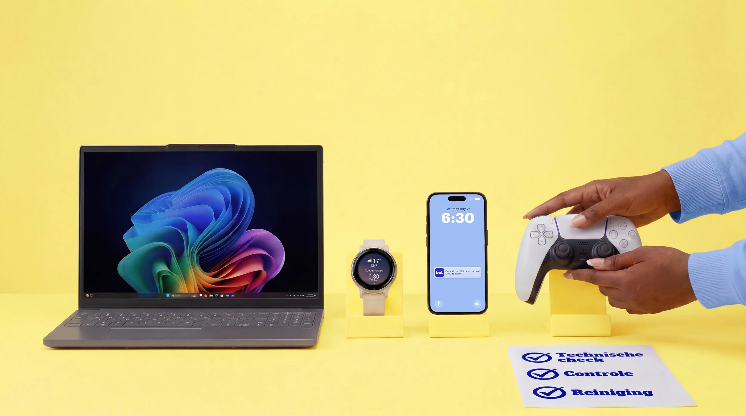
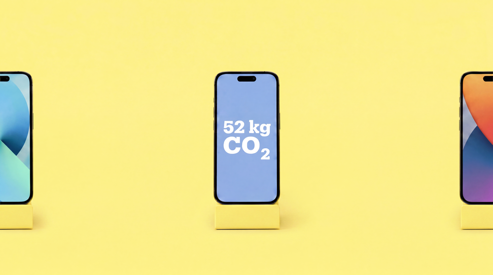
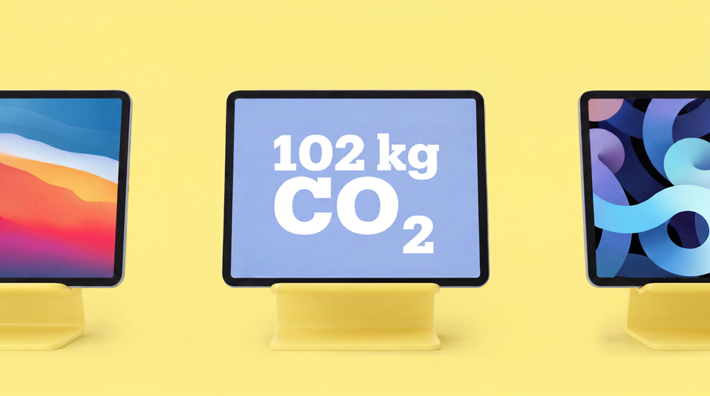
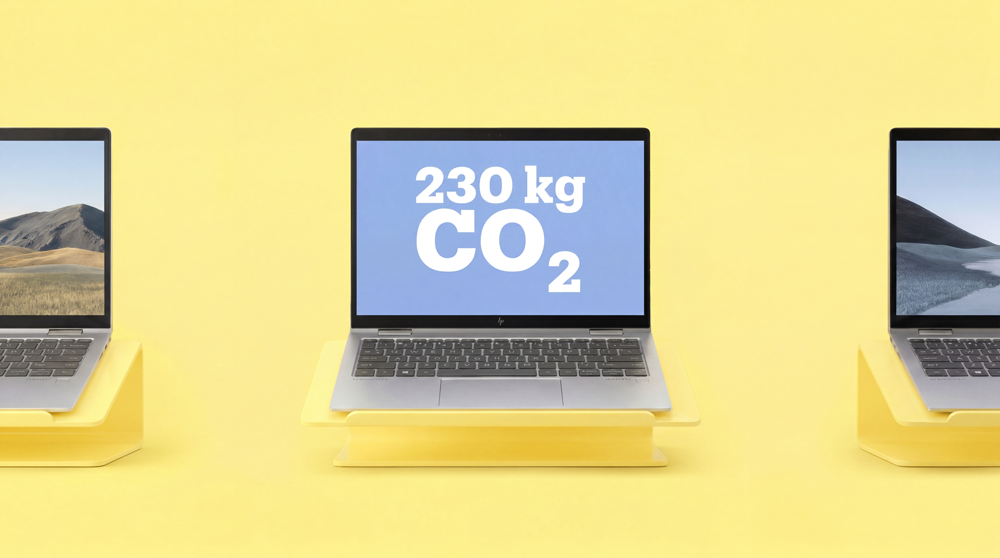
Refurbished needed to feel trustworthy. Products that have had a previous life, selling to someone taking a small risk. Clean yellow, real product colours, clinical precision. The CO2 figures on screen making the sustainability case before anyone reads a word.
Both feel unmistakably Bol. That is what a system does.
The production runs on an AI image generation process we developed around ethical exploration of what these tools can actually do for a brand. On-brand, product-accurate visuals at a speed and scale traditional photography cannot match.
Nine months in. Still running. The calendar keeps moving.