Client: Magioni
Scope: Logo refinement, colour system, brand architecture, packaging design across pizza crusts, American pancakes and frozen pizza
Magioni already had a story worth telling.
A brand built on vegetable-based pizza crusts. The kind of idea that sounds like a compromise until you try it. They had proven the concept. Now the brand needed to grow, and growing meant a system that could hold everything together.
The logo had the right bones. A monogram built around the ‘M’ and ‘I’, enclosed in a circle, with a wordmark that felt considered. We refined it. Cleaner geometry, better proportion, the kind of small changes that make everything downstream easier to execute consistently.
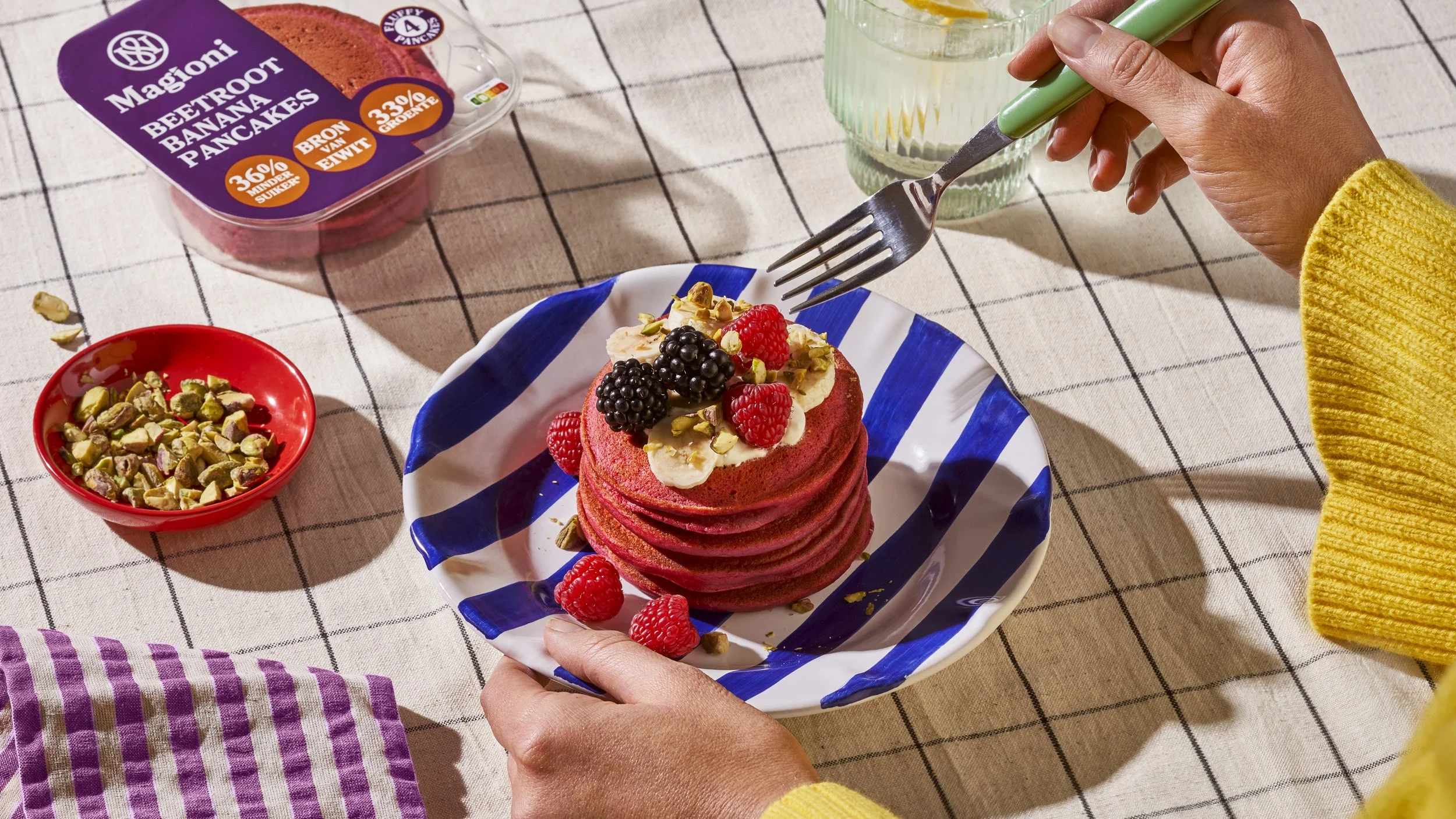
The colour system was the more complex problem. Magioni already had a palette for the pizza crust range. Dark tones, earthy, credible. But a new product category was coming: American pancakes with up to 44% vegetables and that category needed its own visual energy without breaking away from the brand entirely.
We built a colour architecture that could do both. The pizza crust range kept its established palette. The pancake range got three distinct colours anchored to the flavours: carrot cake, beetroot banana, pumpkin cinnamon. Warm, direct, each one immediately legible on shelf. The frozen pizza range extended the system further with its own set of variants.
Six product lines. One colour language. Distinct enough at SKU level, coherent enough as a brand.
The pancake brief had its own creative tension. Pancakes are a comfort category. Vegetables are a health signal. Leading with health would have killed the mood. So we didn't. The vegetables became the visual hero, present, proud, but framed within packaging that felt warm and indulgent rather than clinical. Up to 44% vegetables, and it still looks like breakfast you actually want.
What Magioni needed wasn't a campaign. It was a foundation.
A system that could absorb new products, new categories, new
markets, and still feel like the same brand throughout.
That is what we built.

